Production designer Melanie Jones has worked on numerous projects in film and television across a twenty year career which includes The Purge and Whiplash. She recently took the time to talk to Martin Carr about her involvement with Bill & Ted: Face The Music.

How did you first get approached for this project?
I got a call from my agent saying they were interested in interviewing me and I kind of freaked out a little bit. My big connection was through knowing Alex Winter having done production design on something he had directed years earlier, which in turn lead to him suggesting me for the film. So that was my in and I went from there.
As it takes place two decades on from Bogus Journey what did those initial creative meetings centre on?
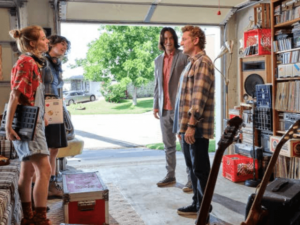
One of the early things we shared with each other was the idea of what San Dimas would look like now. Not just literally the town itself but Bill and Ted’s lives at this point. They are much older and obviously not in the same place we last saw them. Then it was how we wanted that reflected in the production design, which for myself and Dean Parisot (director)the plan was to keep it subdued, embrace the mundane yet without it being sad or depressing. Their lives are still full of wonderful things and people they just haven’t achieved to the goals they had set for themselves. To show that I kept the colour palette neutral to start with, then as they travel through time we explode off in other visual directions.
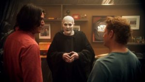
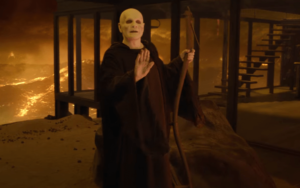
We chose New Orleans because its architecture matched some of the historical places we had in the film and then I really got into Hell. When I interviewed for it I suggested to Dean that the house for Death in Hell should be mid-century modern. He is having a mid-life crisis and trying to reflect something back on him himself. Instead of going for the gothic castle which they had done in an earlier movie, Death is breaking away with a homage to the Stallyns on his wall and having his own house on the hill in Hell rather like the Stahl house in west Hollywood.

When it came to production design how did you remain true to the original films, yet ensure a new generation were equally engaged?
I feel like Dean Parisot, Ed Solomon and Scott Kroopf were the guardians of that, but at the same time everyone had a sense that it didn’t need to match or marry with anything that came before. One because it‘s so far down the line and these characters have both grown as people. Even though their lives are not in the best place a lot of time has passed, so in some ways we wanted to show that evolution but do it in a way which felt authentic. Inherently it is tied to the other movies through these characters, but they have changed a lot since then. This made it easier for me because visually there were no limitations and no one enforced any restrictions during the project. Everyone was open to new ideas and wanted to get my interpretation, which happened to align with Dean in a lot of ways so we were on the same page.
How instrumental were the writers Chris Matheson and Ed Solomon in shaping this universe creatively?
Their script was essential in helping establish the aesthetic during my initial design process. My method of production design was discussed mainly with Dean because I was mostly in contact with him, but anything of concern would also go to Ed and Chris. As well as Scott Kroopf who executive produced and was quite involved in all of it throughout. However, ultimately it was a very collaborative process between everyone and not necessarily always me just one on one with any particular person.

When it came to conceiving the future as seen in the film was there any specific research you undertook?
Dean was very clear at the beginning that he really like Spanish architect Santiago Calatrava. So he wanted at least the upper part of this futuristic world to reflect that design choice, meaning that the illuminated upstairs elements were a combination of some set pieces and plenty of VFX, which really worked best because for the film as going to the actual location in Spain wasn’t possible. The thing we built entirely is what I call the “hologram room” but is actually where we watch the hologram Earth falling apart. This set reflects the dark underbelly of what’s up top. For this set we got a lot more into conversations around future technology and what that could be. With the scientists down there building this robot, being able to view the past and so on it became about where exactly this stuff is coming from. I didn’t want monitors everywhere as that felt too current, so instead we went for architectural simplicity to the point where it felt almost like a power plant. There are pipes everywhere and because San Dimas has a lot of water in the future it made sense for them to be using hydropower. So it is the contrast between those aspirational high minded elements above and our more primal darker urges below, which exist as a counterbalance.
Although you have already touched on Hell briefly it was clearly pivotal for you. What were your first impressions of it off the page?
For me my first thoughts about Hell came down to the architecture of Death’s house as depicted in their script. Besides Bill and Ted finding their daughters and everybody in the pit the story hinges on them going to his house, making up with Death and moving forward. I wanted it to be funny but I also wanted it to be cool. It was silly things like him building this house out of wood in hell, which is not going to hold up great there. The texture inside is burnt wood and the rock n roll element comes through in the geology which I wanted to be very black. We spent a great deal of time on those rocks, while Dean put a lot of great background jokes into every scene in Hell. I also wanted to go black because it felt simultaneously dramatic and rock n roll. He has a lava coy pond.

Musical icons past and present play their part in making Face The Music work. If you spend time with anybody alive or dead who would it be and why?
There are so many I would love to talk to but honestly my simple answer is probably my mum, because she was a brilliant person who I love and miss. I would have loved to meet Frank Zappa, which coincidentally I know Alex Winter is doing a documentary about right now. He was given access to his whole archive and apparently there is some really great stuff in there.
What are your key considerations when it comes to signing on to any project?
Aside from a script I connect with, it is getting the opportunity to design something that I haven’t done before. That is usually the real draw so for Face The Music I found Hell hugely attractive alongside the variety of places we travel which made it very compelling. Ultimately I like to do something new because a lot scripts happen in very similar places, despite having a different story attached.
Describe for me your perfect Sunday afternoon?
My perfect Sunday afternoon would be a quick swim, a little bit of sun and a nice lunch.
Melanie thank you for taking the time to talk to Flickering Myth today and take care.
Bill & Ted: Face The Music is out now in cinemas and video on demand in the U.S. and will open in cinemas in the UK on September 16th.


